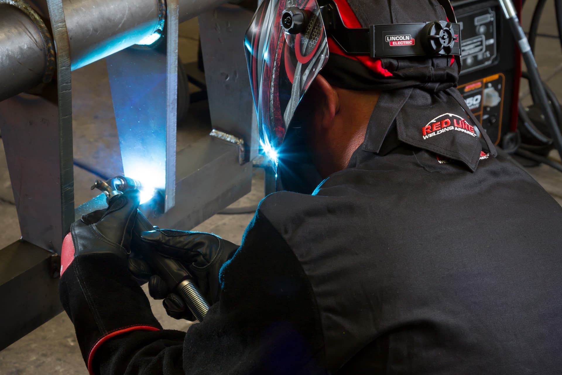
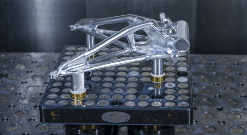
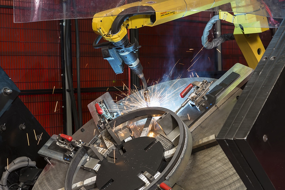
We are now proud to transform yet again, this time as Baker Industries. The Baker Industries name is meant to inform our aerospace and automotive customers, as well as prospective new customers in other markets, that we bring our A-game to meet their needs and solve their challenges. Our A-game integrates our best people with the best technology, equipment, and practices to deliver excellence in every project for every customer.
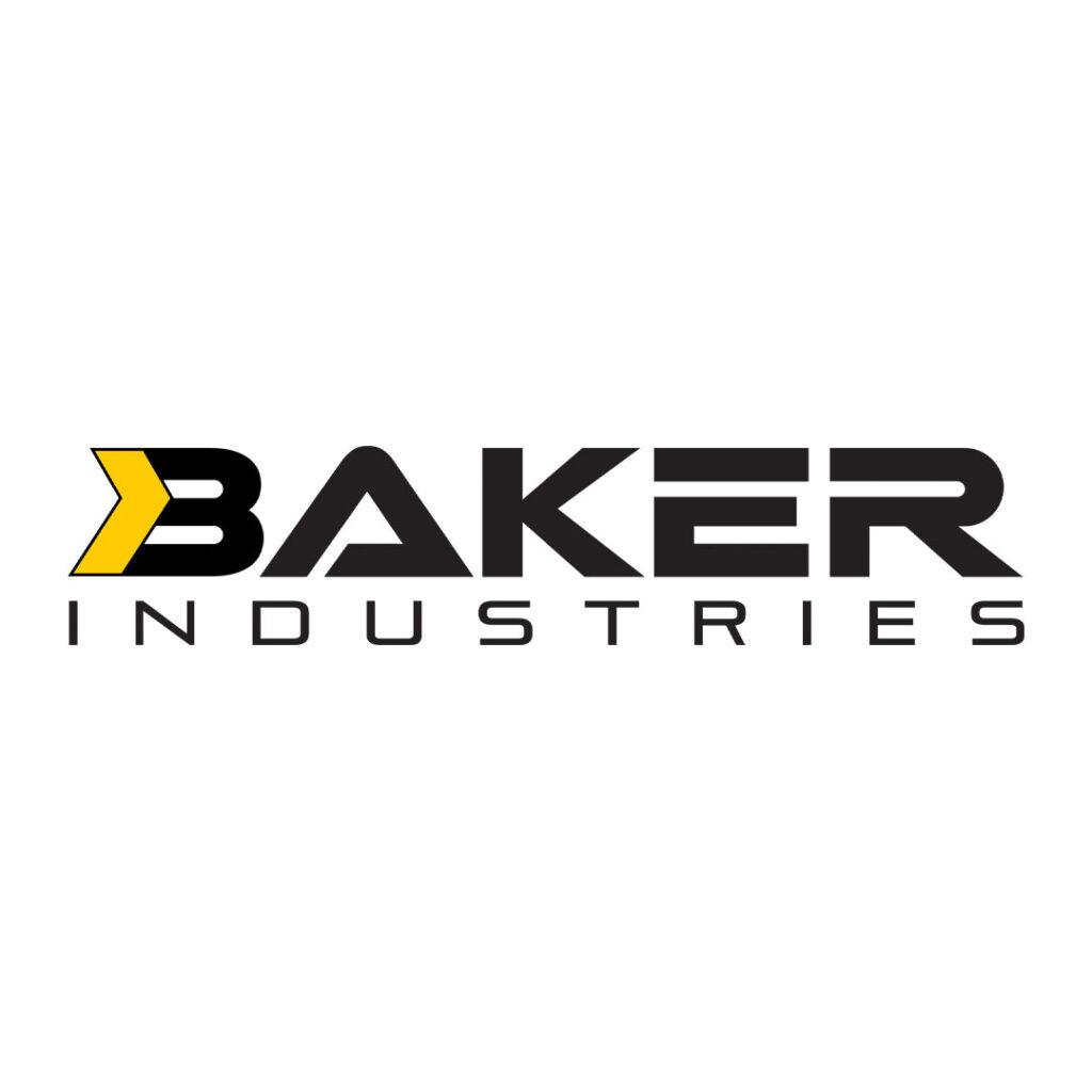
The New Baker Industries Logo
Along with introducing Baker Industries, we’re also introducing a new look that begins with our logo. The new logo is designed to demonstrate forward momentum while promoting the strength and bold attitude that defines Baker Industries. It begins with our feature yellow color in an offset arrow which starts the motion that runs through every letter. The arrow is intentionally not uniform, it’s offset to indicate the energy that propels us forward as a company, and as teams dedicated to propelling our customers forward. From the stylized “B”, every letter has a firm foundation true to our trustworthy reputation, while using typography that’s at once bold and in motion. Every letter draws attention like the attention we pay to every detail in our work.
